


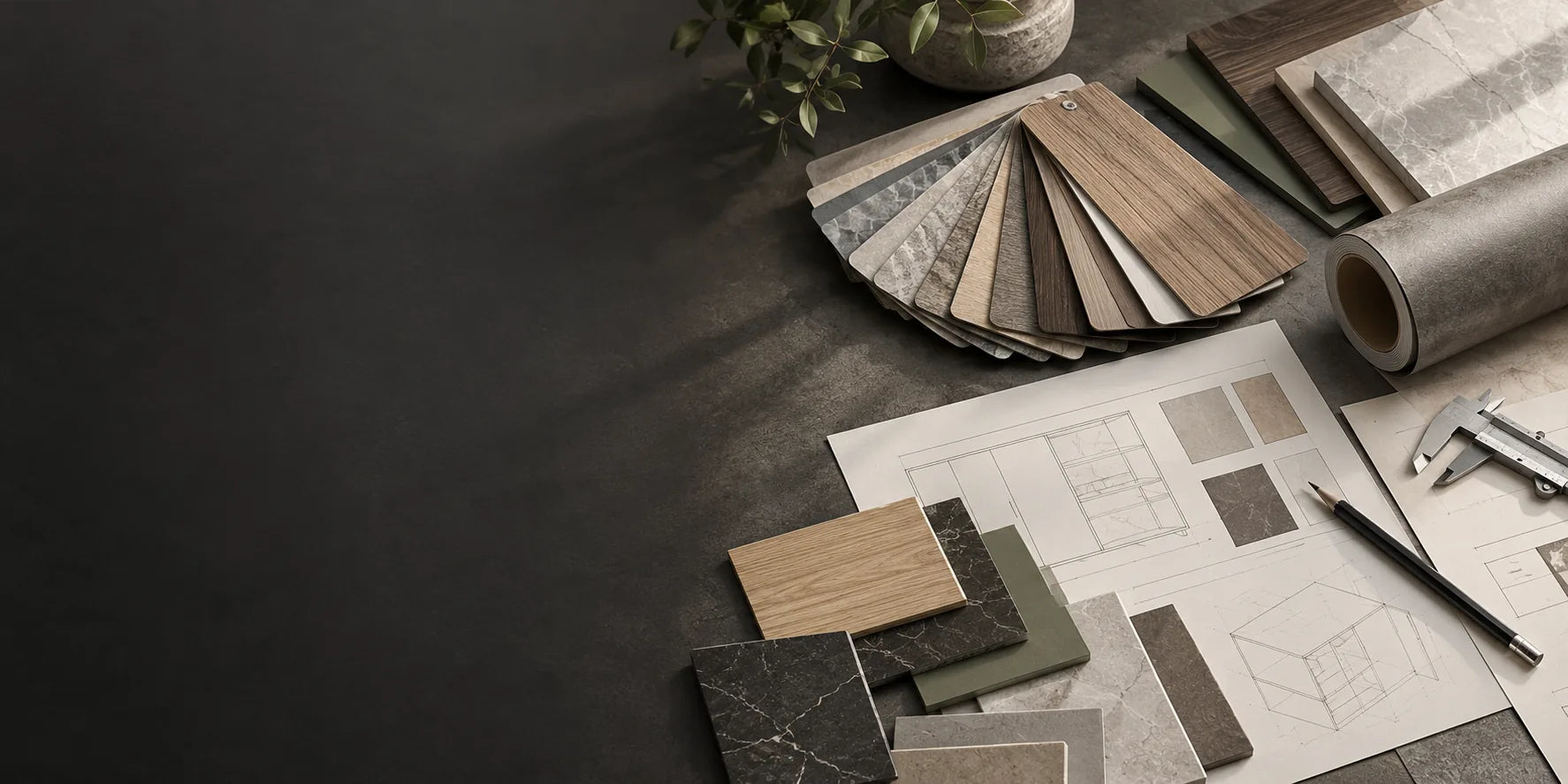
Warm Neutral
Layer warm wood, soft stone and quiet solid colour.

Colour & Combinations
A finish rarely stands alone. Explore palette combinations that consider undertone, grain scale, contrast and texture so cabinetry, walls, furniture and adjacent materials work as one interior language.
Palette Stories
Tone Scale
Material Recipes
Pair light oak and soft mineral neutrals.
Warm / quietBuild balanced combinations from matte tones and subtle texture.
Natural contrastUse darker grains or metallic directions selectively.
Soft / architecturalUse mineral surfaces as the base and metal direction on selected focal elements.
Sharper contrastPalette in Space
Detail Crops
Palette Resources
Link each palette to material families, sample requests or downloadable references.
Tell us the application and visual direction and we can narrow the sample request.